Bag redesign
I worked on the redesign of the iconic Eight O’Clock Coffee red bag line during my second year at EOC. The team had worked alongside a packaging agency to develop a variety of different ideas to test with consumers, and after getting the results, narrowed it down to a few options. I worked with marketing to develop different iterations using those directions, and went through rounds of consumer testing and internal reviews. Once we finalized the design, I produced the mechanicals for 60+ bag and K-Cup cartons across a variety of sizes on a short timeline.
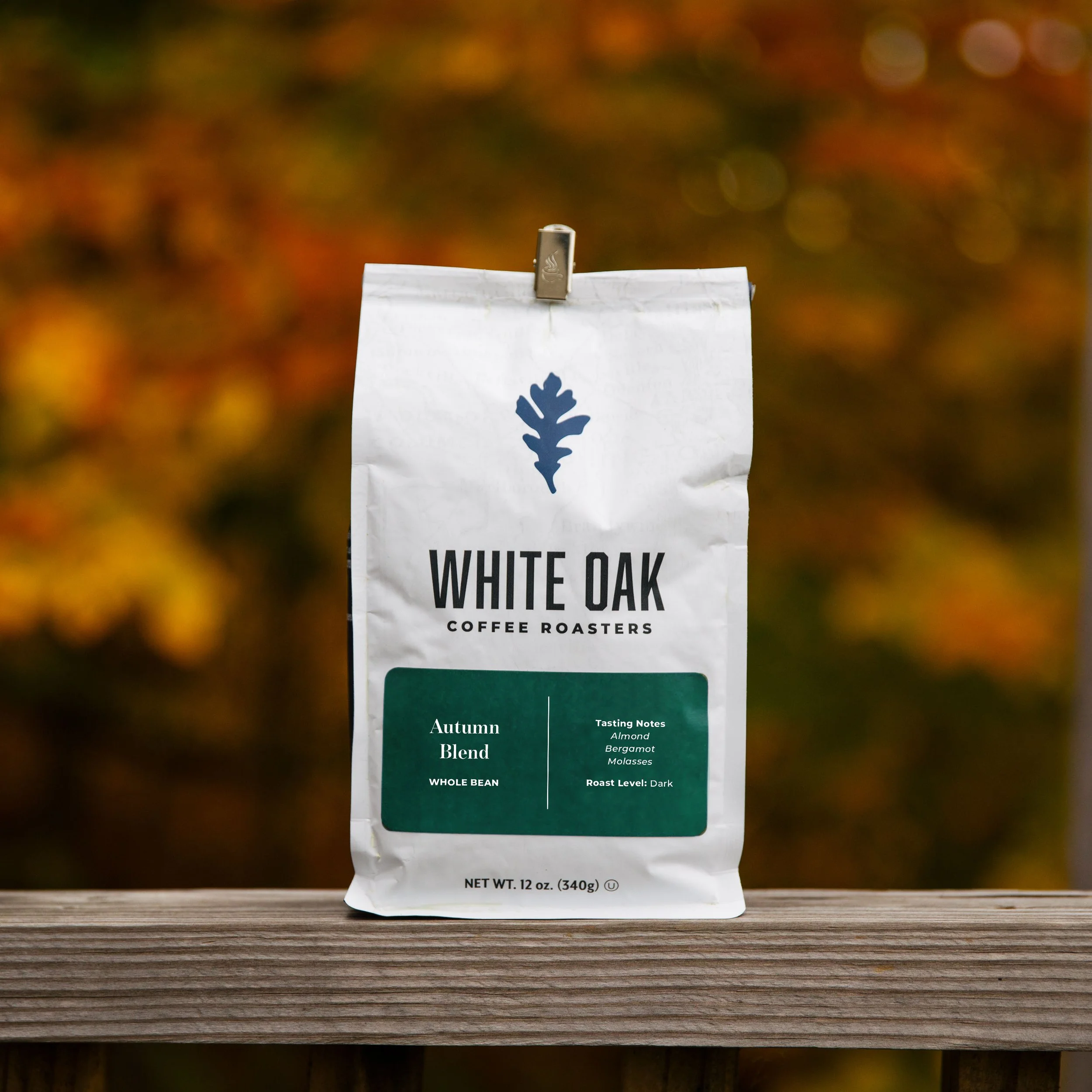
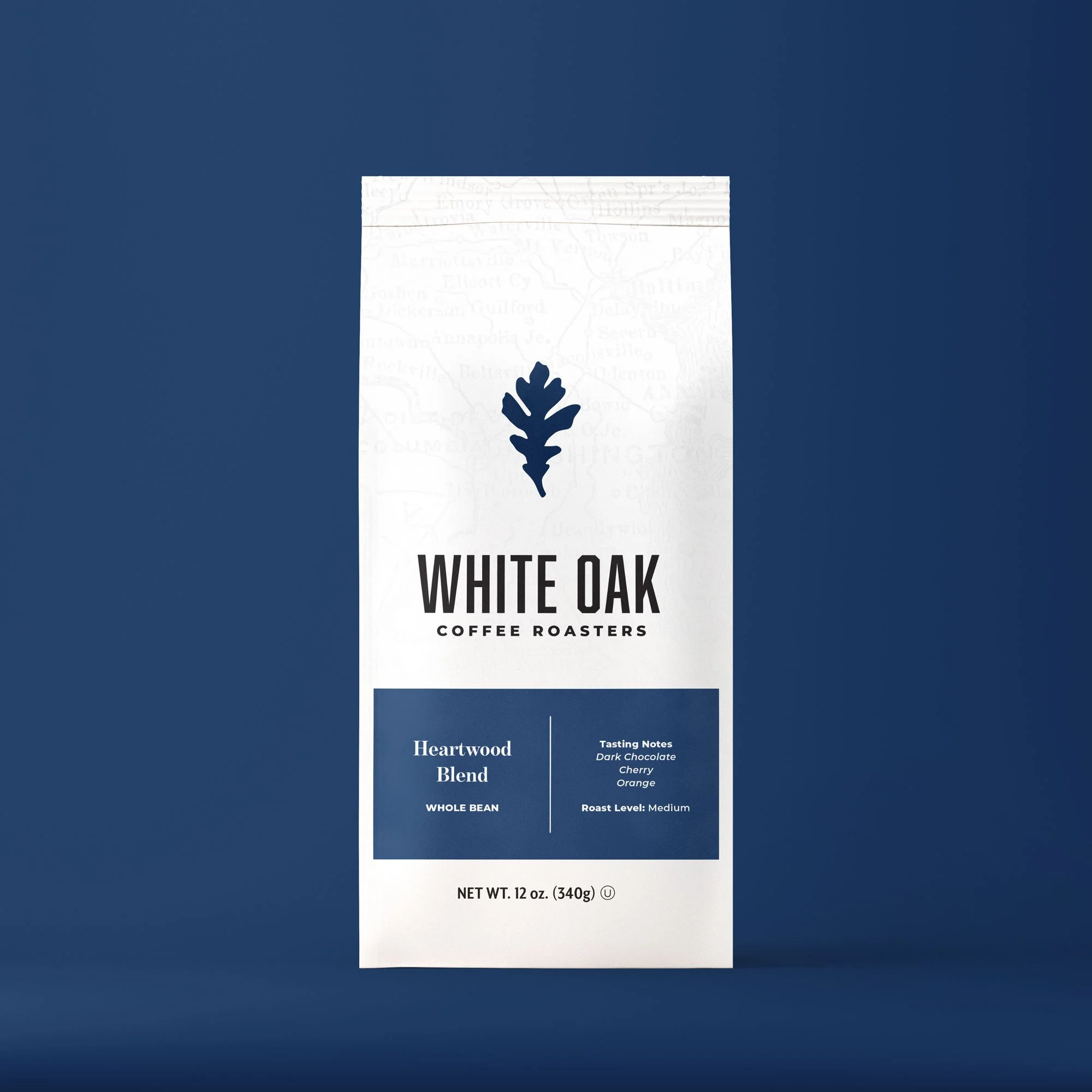
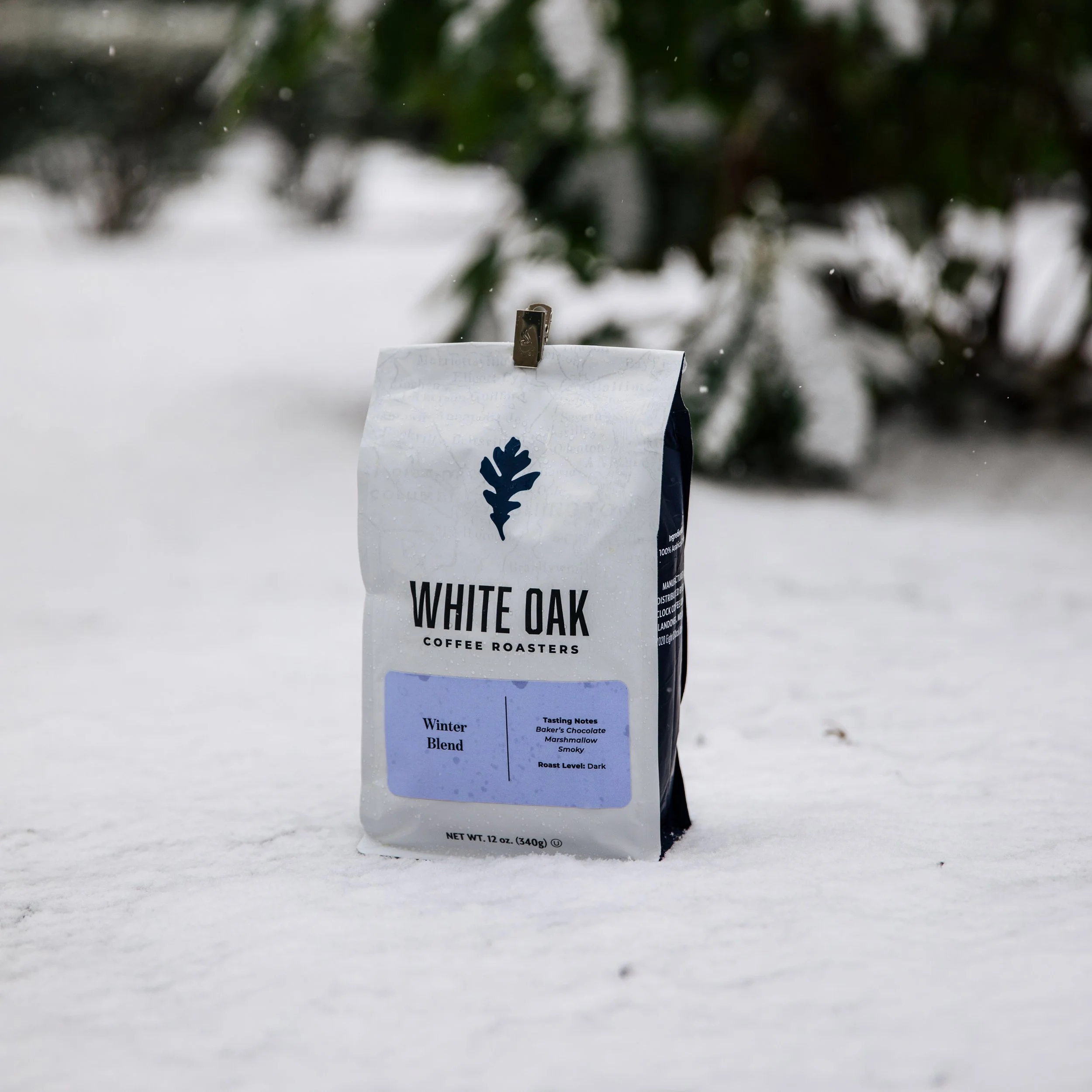
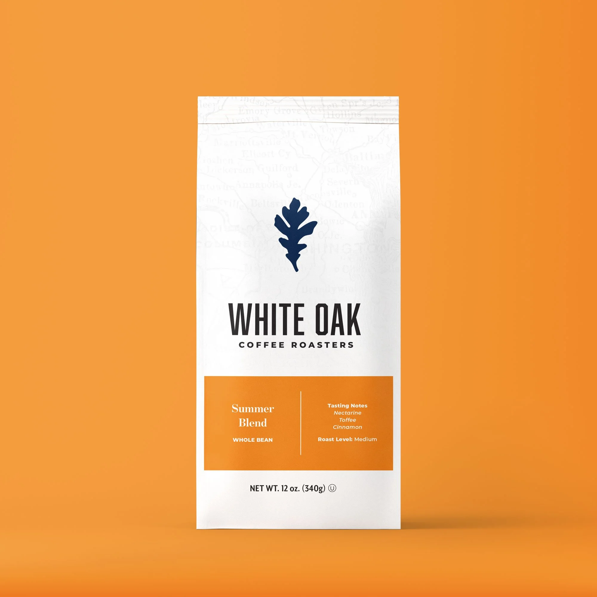
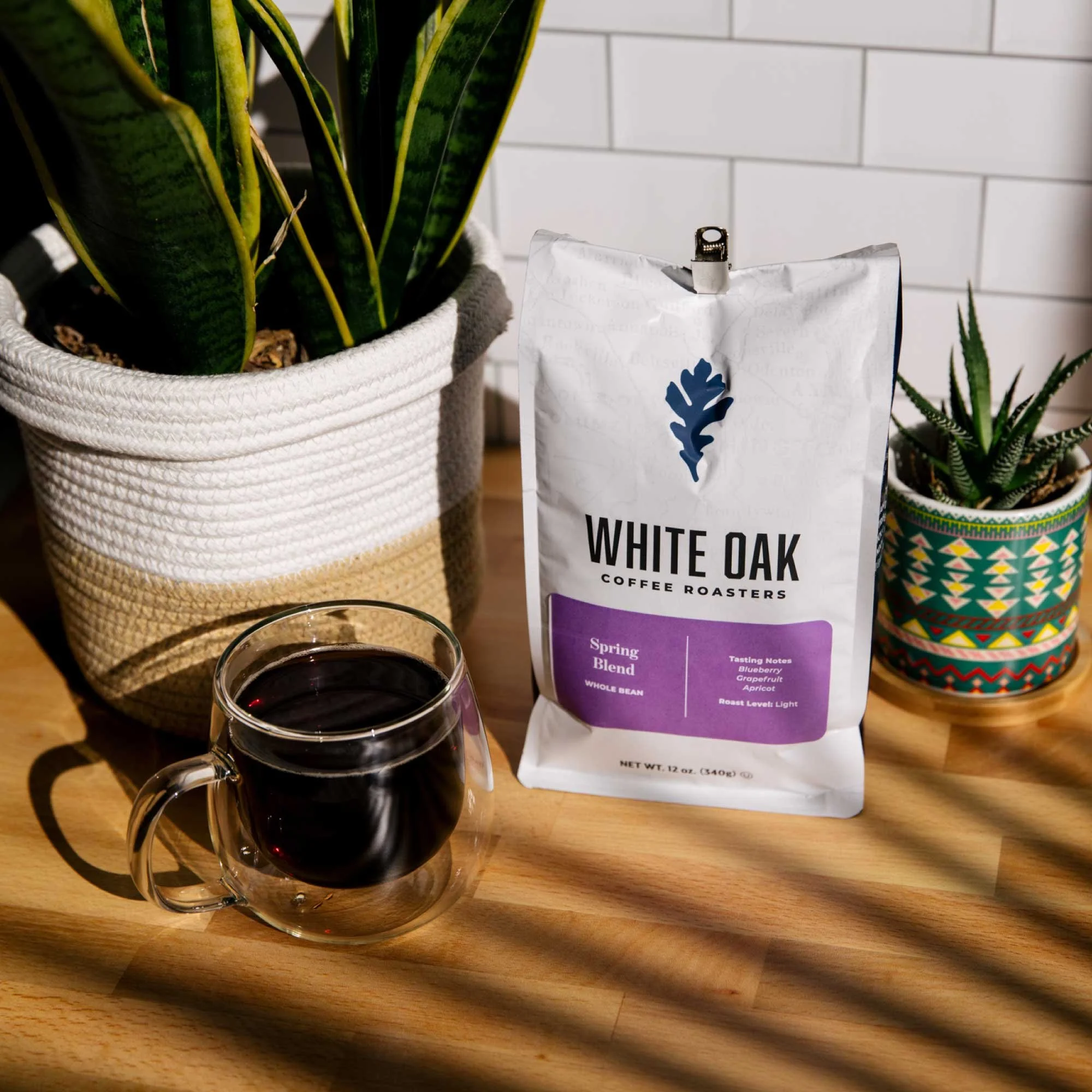
White Oak Coffee Roasters
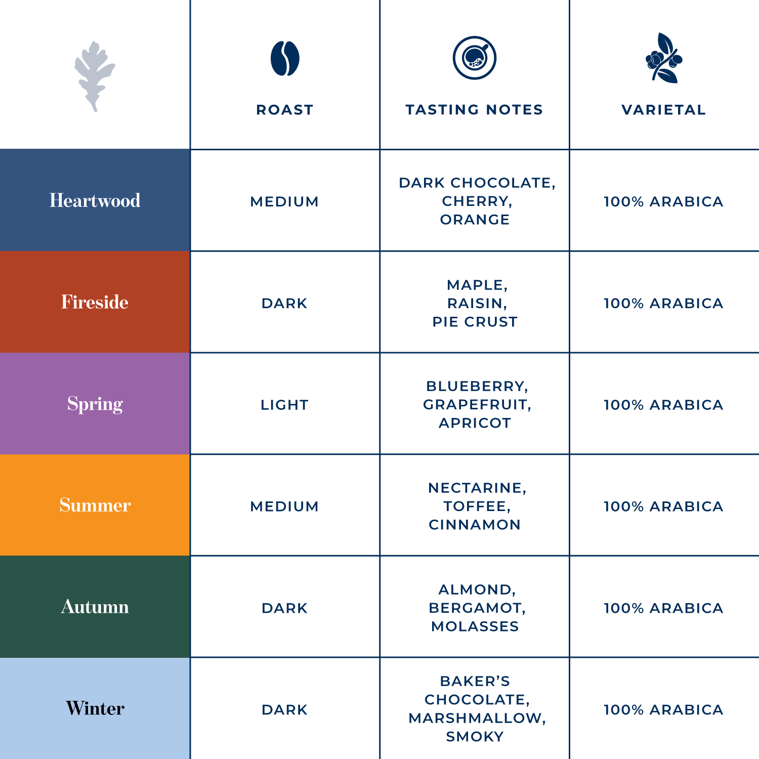
I worked with a small team at the Eight O’Clock roastery to help launch a 3rd wave brand called White Oak Coffee Roasters. It was named for the state tree of Maryland, which is where the EOC roastery is located, and the top half of the bag has a subtle map of the state spread across it. It started as a DTC brand that would offer a single flagship coffee, the Heartwood Blend, alongside rotating single origin and seasonal varieties. White Oak also focused on sustainability and giving back to the community through a donation-per-bag-sold program that supported local green space charities.
I worked on the brand’s packaging, website, and social media presence.
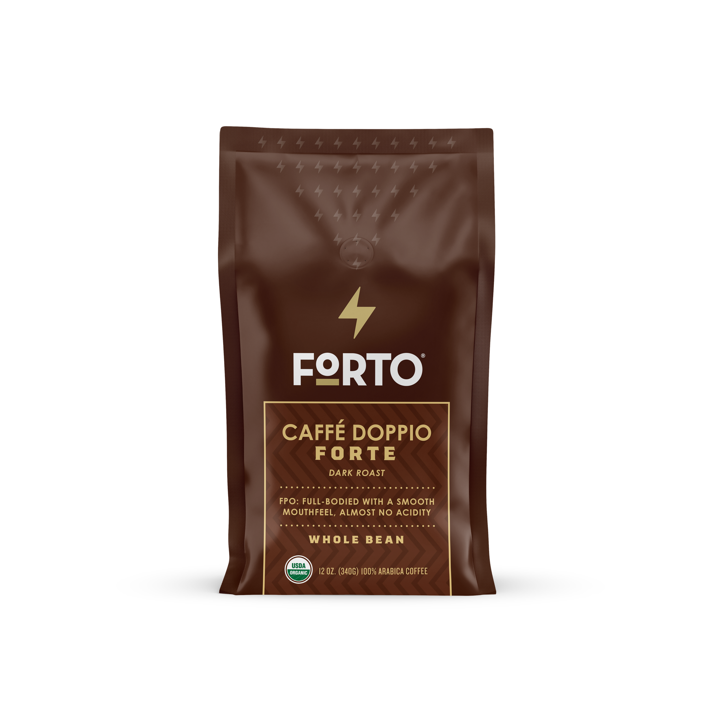
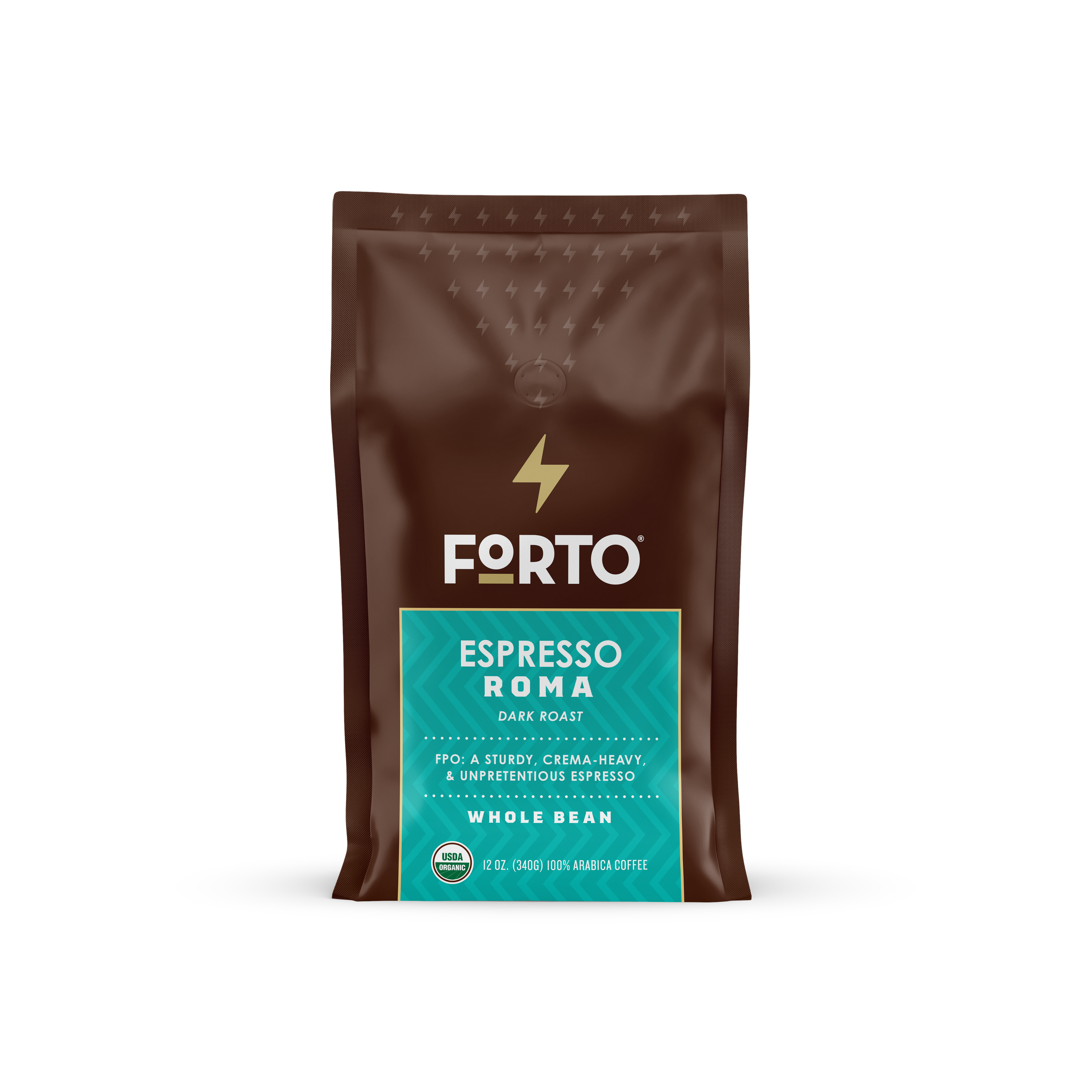
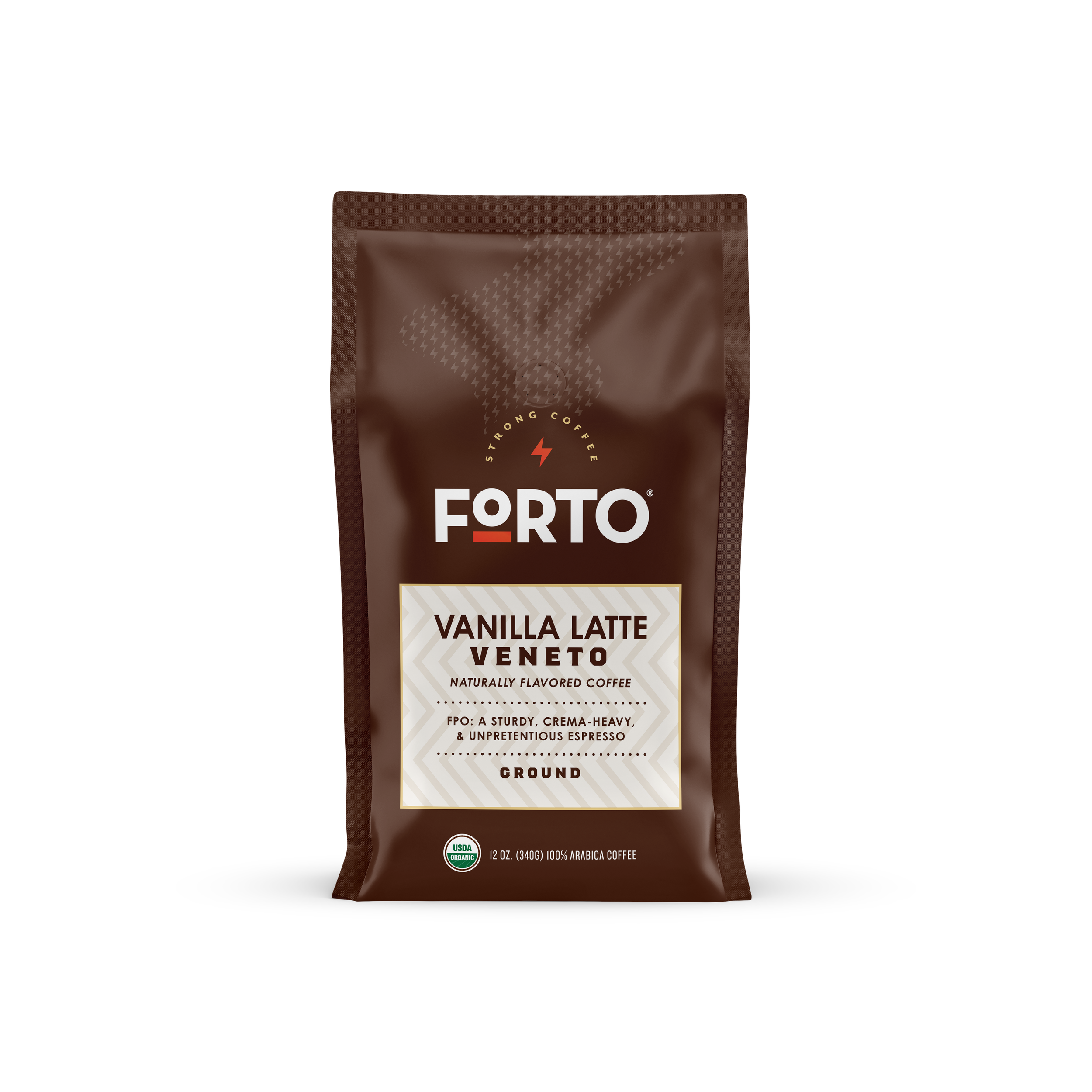
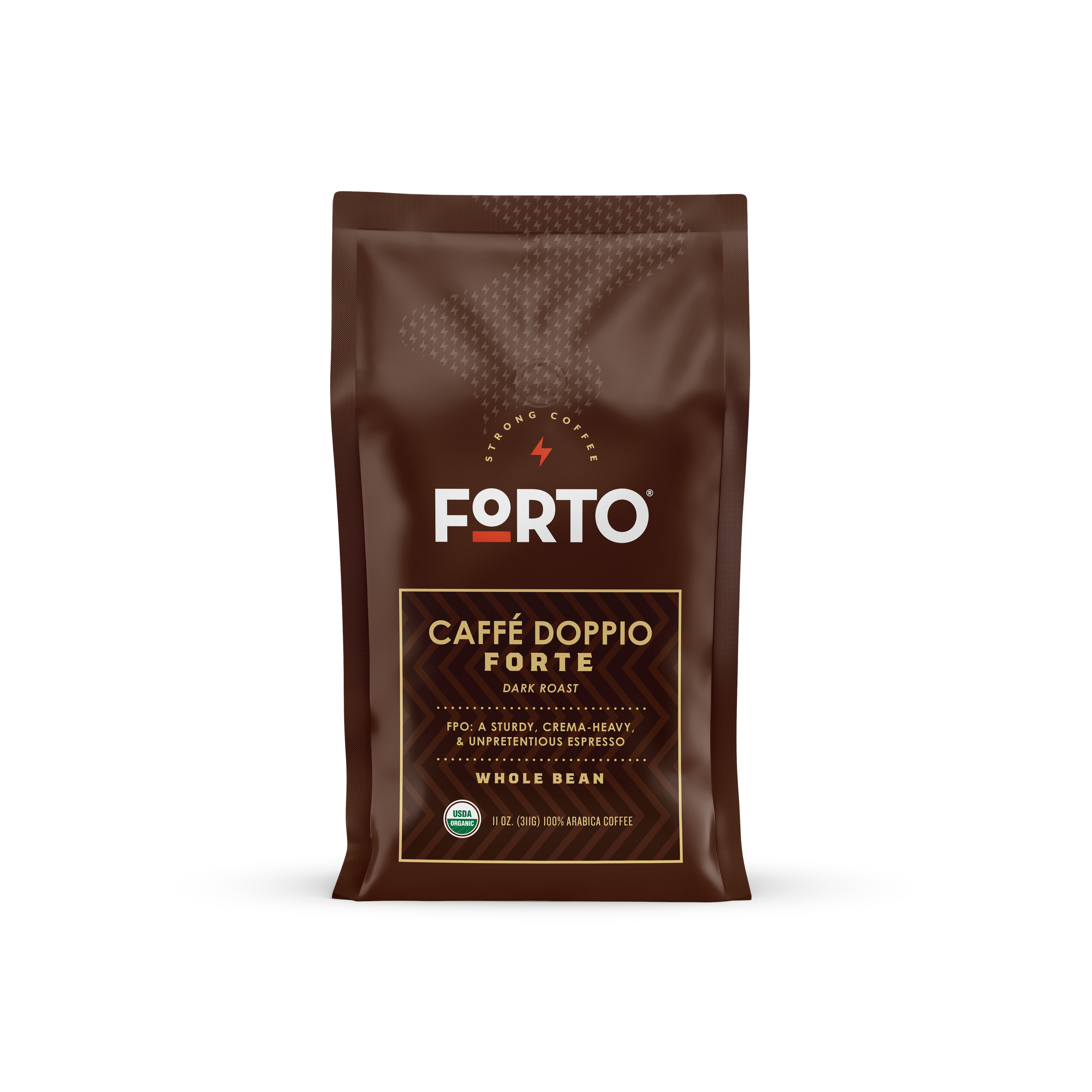
Forto Preliminary Work
We also launched a partnership with Forto to create a traditional coffee offering based on their energy drinks. The original pitch was an Italian-café themed line, and these were some of the designs I put together based on the discussions with our marketing team. We wanted to keep attention on their branding and experiment with using their lightning bolt as a repeating symbol.